Tuesday, February 4, 2014

Working with Fossils

A Sculptor Works with Fossils

One of Perry's many projects of late is participating in the work of the Calvert Marine Museum in preparing and preserving fossils.  It is fascinating work and provides new perspective not only on local paleontology, but on the variety and versatility involved in the life of a professional sculptor.

For videos demonstration click on the link below:


Silk Painting

Now for something completely different...
Silk Painting

This summer I decided on a "bus man's holiday" and tried a completely new medium, silk painting.  According to many sources it is said that the history of silk begins in China during the 27th century BCE. Light, strong and soft silk was an immediately successful commodity.  One of the oldest surviving examples of silk painting depicts a dragon and is from the Mawangdui Tomb dating from the 16th century BCE.


Silk painting with resist technique emerges fully in the 2nd century AD India and is then carried to Western Europe by the Crusades during the 12th century AD. At the same time, silk painting was spreading east to Java and Indonesia.  

I am by no means an expert, but here is my journey getting started with silk painting.  I hope it is a trip you enjoy too!:
Silk painting begins with a sketch drawing that is refined into a clean line drawing.  Think "coloring book" drawing because that is essentially what you need to do is create discrete areas for color.
To prepare your painting surface you stretch silk fabric on a clean painting stretcher.  I highly recommend you review in line resources like those provided by supplies like Dharma Trading Company and review You Tube demonstrations.  Just type in silk painting and you will find a wealth of information.

The next step is to transfer your sketch on to the stretched silk itself.   You can draw your design on with a disappearing ink marker, similar to those used by quilters, or you can draw directly on the silk with the resist called gutta.  I like to place my drawing directly under the silk as a guide.  The silk is transparent enough that I see it.  It does take practice to gain a steady hand so I recommend that when you get started use the marker.  I still use the marker for detailed work that needs careful alignments.

You may be wondering what is gutta anyway? Well, it is a rubber base liquid resist.  You buy it in large quantities and then transfer it to a small bottle with a drawing tip, similar to a pastry chef when icing a cake.  Gutta comes in several different kinds and colors.  They all have different requirements and tradeoffs so best to consider all this before you get started.  Here I decided to use a black gutta and a water soluble gutta.  The black gutta will leave permanent black lines while the soluble gutta will wash out leaving a white line of the undyed silk.


If you look carefully you can see in the next image the addition of the flowers in the water soluble gutta "under" the moths.  I like using the different guttas in order to enhance the illusion of foreground, middle ground and background.


Here is the first application of dye.  I tried to dye the largest areas first and then move into the smaller areas.


Here is the final piece off the stretcher, dye set, washed and dried. Note that there is some loss of color intensity with washing and drying.  I have found that I can compensate for that by redying areas. 


Prepared Drawing Surfaces

Tired of the same old drawing surface?
Try Stained and Coated Drawing Surfaces


Problems Keeping a Sketchbook?

Are You Having Problems Keeping a Sketchbook?


One of the most difficult disciplines to maintain as an artist once you leave school is keeping a regular sketchbook.  Yet, there is nothing more essential to keeping your mind open, your skills honed, and your creativity flowing than the unrestricted and safe space of a personal sketchbook.

Here are just two recommendations:
1.  Get a sketchbook buddy. You've heard of gym buddies, coffee clutches and diet partners, well why not a friend who will be supportive, shares your love of drawing and painting, and help keep you focused on what is really important to you...Your Art!

Here is my sketchbook buddy!  We meet for 30 minutes to an hour once a week to draw.


2. Try the Sketchbook project:
Check out mine:
http://www.sketchbookproject.com/users/mecarsleyart/artwork


By the way, it was my sketchbook buddy, Kourtney, who got me to participate!


Here's where to sign up:
http://www.sketchbookproject.com/

Hope that is some help!  Be sure to share your work with our little blog community!

Upcoming Field Sketching Trip

Mark Your Calendar to Get Rid of Those Winter Dulldrums!
Saturday, March 22nd, 2014
The Carsley Art Studio will be hosting a field sketching trip to
 The National Zoo Washington, D.C.


Meet us under the big Animal Clock at 10am for a day of animal drawing instruction.
Stay as long as you like. We recommend taking metro and a brown bag lunch.
Check this blog for any changes in plan due to inclement weather.

Master Drawing Copy Exercise

Master Drawing Copy Exercise

Many of our students have asked about drawing exercises that build confidence with measuring, proportion, as well as in approaching the human figure.  One of the best exercises for this is copying a master drawing.  Please see the instruction sheet below.  As always, if you have any questions feel free to comment or email us.  We are always happy to provide on line feedback!


In light of this exercise, you may want to consider a terrific addition to your art library:
Drawing Lessons from the Great Masters by Robert Beverly Hale
ISBN 0-8230-1401-0

Monday, February 3, 2014

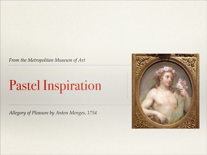
Getting Started with Pastels


Below are some beautiful examples that can lend some historic perspective
regarding the medium of chalk pastel from a 2013 exhibit
at the Metropolitan Museum of Art in New York


Wednesday, March 27, 2013

Sketching while on Travel


Creating and Maintaining a Travel Sketchbook

One of the most rewarding parts of travel can be marrying it with the creative process through a travel sketch book.  Here are a few tips on how to start and maintain a travel sketch book:

First, consider your schedule and destination in considering your media, techniques and equipment.  All too seldom do artistic travelers have the opportunity to linger upon a single subject as much as they would like.  Be sure to have a small, light weight, digital camera (I find my IPad perfect for this) in order to quickly document what you see first or on the fly, thereby creating a visual reference file for yourself for use at a more convenient time.

Be realistic about time and schedule a private sketch time for yourself everyday when you can return to a subject or work from your photo references to finish up a quick plien air start.  Be realistic too about the amount of time you can spend on a single work and keep your works small and your media and techniques simple.  Save the large works and media experiments for your studio at home!

Find a sturdy, easy to use container for your media that fits conveniently into what ever tote you will be carrying daily with you as you tour.  I am quite fond of the one pictured   here.  (Please note the six inch clear plastic ruler in the picture for scale). It is compact, lightweight, and sturdy protecting the contents from any impacts.  It closes securely with a zipper and has tight elastic to secure pencils and brushes.


I prefer a hard bound sketchbook.  I find that spiral bindings can become bent and caught on things.  The hard binding also provides a convenient drawing surface.  The paper I use is usually for both wet and dry media.

The sketchbook here was for my recent trip to Italy.  You may note that it is a landscape format.  I purposely chose that as I knew I wanted to do some landscape sketches.  Be sure to consider the proportions of your sketch book with regard to your anticipated subject matter.

Be sure to pack media that needs a minimum of space, creates a minimum of mess and light weight equipment so you have maximum flexibility as to where and when you can work (I love to finish drawings on the plane).  Also, no one wants to lug an easel up and down mountain sides or through crowded city streets unless you intend to stay awhile or stay close by.  


Staples my travel sketch kit includes: permanent ink drawing pens (similar to the Micron brand) as well as a small assortment of hard and soft leaded pencils.  Don't forget the sharpener, kneaded eraser, small ruler as well as a stump and tortillion or two for blending.  Sometimes I like to bring conte pencils which work well for landscape and architectural subjects. but, make sure your sharpener can accommodate the larger conte barrel.  Leave the pen knives and x acto knives at home as airport security will confiscate them.  Another good addition are wash pencils which can be used as traditional sketching pencils or you can add water and achieve a wash effect.


With regards to wet media, I include several types in my kit.  The first are watercolor pencils that behave like normal colored pencils when dry and then can melt into soft washes with the addition of water.  I prefer the Derwent watercolor colored pencils and like to use the watercolor brushes that have the hollow handle as the water container for achieving the wash technique.  I also carry a small, preloaded, plastic folding palette for my traditional watercolors.  I do not bother with tubes as the per loaded, dry palette will have more than enough paint for a two week trip.  For use with this palette, I carry three small brushes, two flats and one detail.

And that is really it. Here are a few examples of sketches created from the media kit described above.  Please note that I find many of these mediums combine well.

The sketch of the olives is a combination of pencil and watercolor:
  

This sketch is a simple watercolor monochrome.


 This sketch combines watercolor and ink.


This sketch began as a colored pencil sketch and then I added water.


Wednesday, January 30, 2013

Mid-Winter Project for Botanical Art Lovers

Mid-Winter can be a tough time for botanical artists to find inspiration!
Looking for a project to get rid of those winter blues and to keep you drawing everyday?
Try forcing bulbs and drawing and painting them daily!


Here is my work in progress.
 
The Subject:
Any spring or fall bulbs will work. However, keep in mind that taller growing flowers may eventually need support.  I prefer using glass beads in a glass container, but you can use a regular pot and soil or pebbles and stones.  The glass beads make it possible to keep the entire affair clean and easy to care for.  Also, the beads allow you to observe the bulb growth both above and below.  Keep enough water in the beads/stones so that the bulbs always have "wet feet."  If using soil bury the bulbs only half way and keep the soil moist, but not soaked.  Be care to avoid submerging or soaking the bulbs completely, they may rot instead of bloom in those conditions.  Note the photo where the bulbs are buried only enough to support them (just less than half the entire bulb).  

The Approach:
There are two ways you can approach this project.  The first is to use each daily drawing or painting as an opportunity to explore a single subject in a variety of media or techniques.  If this appeals to you, then I suggest you purchase and prep a variety of papers for different wet and dry media that have a variety of textured finishes.

The second approach to this project can be seen above.  Here I have chosen this time to document the growth process through a single medium (hard lead drawing pencil with watercolor, a favorite of mine) in a single sketchbook.  I was particularly excited to find this Japanese made folded sketchbook shown here.  My plan is to display the finish work on a table top, like a Japanese screen.  
 
One word of caution, I am finding that the Japanese paper, although wonderful, gets saturated easily and I have to give washed areas additional dry time before I can go back into the work and add detail.

Whatever approach you take do consider the ultimate sizes and composition for displaying your works as a single group.  Your growth process artistically is being documented along with the growth of the flowers, embrace it, celebrate it and bloom together!

Here is an older unfinished work I began last year of a daffodil bulb.  I really like this piece and plan to complete it as a single work. It is done in 4H drawing pencil on 90lbs. Hot Press Arches watercolor paper (very smooth finish that allows you to capture  great deal of detail).  I will be sure to post again once I have added color.  Remember you can use the pencil to add value with watercolor as lone as you use a hard lead that will not be so loose as to mix with the paint and muddy the colors.  
Questions?  Write me!

Friday, January 18, 2013

Upcoming Lecture Event!

Evening Workshop Exploring the Techniques
of the Artist
William Hamilton Gibson
with
The Guild of Natural Science Illustrators
http://www.gnsi.org/event/workshop/gnsi-dc-sketching-ink-wash
Tuesday, February 19th, 2013

Tuesday, January 15, 2013

Mary Ellen's Latest Workshop at the US Botanical Gardens

A special thank you to Judy Thomas and Celeste Johnston for such a kind and thorough write up!
Be sure to visit the Central Virginia Botanical Artists Group on line!

The class in the United States Botanic Gardens classroom with our teacher, Mary Ellen Carsley, at the head.


I (JT) was foiled by a zig zaggy, "plaid" cactus!

By Judy Thomas, Celeste Johnston
On January 12th and 13th, 2013, CJ and I took a class at the United States Botanic Gardens/Corcoran entitled "Scientific Illustration."  This introductory course, taught by the excellent Mary Ellen Carsley,  included the basics of scientific illustration. In the course we learned the conventions of this type of art, one that involves visually portraying accurate scientific information about a subject (generally a plant or animal) so that scientists can clearly communicate to one another in printed form.
First, we learned about the basic materials, than spent some time learning about measurement.  Obviously, measurement (and accurate counting of repeated features) in this field is critical.  Mary Ellen shared that scientific illustration(SI)  is a collaborative process between scientist and illustrator and should answer these questions: What is my subject? What am I trying to say, specifically? And, lastly: How can I communicate this clearly and concisely? The four elements of this method are line, value, texture and color, though most of these illustrations are black and white line drawings and value does not have the same meaning as in botanical illustration.  SI uses no cast shadows, no interior shadows, does not really depict depth, nor is it concerned with shading or intense value gradation.  
Next we learned about the "hierarchy of the line," that has three basic levels, though there can be many more: the profile, or thickest, line at the outer edges (which thins as it crosses behind another part of the object); a mid- or medium-weight line, the next level inward, and; a detail line, often drawn using a fine crow-quill dip pen or technical pen.  Contrary to the way we usually draw, the thickest, darkest line is the outer line, and the line thins as you enter the interior of the object. Lastly, texture and some minor sense of depth are achieved by using a broken line or dashes, and stippling, which also vary in size as you proceed inward.  In some cases, the profile, mid-level and detail lines may become "lost and found," or break up, when there is something (not air) behind it.  Below is my (JT's) humble attempt at an illustration of a bell pepper.


Two basic (draft) scientific illustration sketch attempts of a bell pepper.  The top is the "elevation" view (entire object from the side, uncut)(in technical pen) and the bottom is the horizontal section (dip pen with India ink) (by JT)
There are other views in addition to the two depicted above.  The top of the object can be called a "roof plan" to continue the use of architectural terms. A reflective view includes two, sectioned halves. Another important view is the habitus view is how the plant appears in nature, with the fruit, flowers, leaves and stems drawn in correct relation to each other, and sometimes in color.  The habitus view, distinct from the others, does include a greater sense of depth and movement and can be seen as more "artful" than the other views.

The greatest benefit to me (JT) of taking this class was the reminder to measure. Like many people, I just want to get down and draw, but drawing a plant without measurement leads me into trouble. During the class, and afterward, I tested myself by drawing first and measuring afterward: each time I found I was off, drawing the object at least 20 to 25% too small!  And that was when I thought I was being careful! One good tip from the class about measurement:  never mark more than three points that you have measured without connecting them, or you lose track of what it was you measured.  I will invest in a pair of calipers and a gridded, transparent ruler to make measuring easier.  Another valuable lesson to me was the value of being able to render a subject down to its simplest components.  This helped me to see the object in a "macro" sense and give me an idea about the overall "presence" of the object transferred to paper.
Mary Elen is an excellent teacher, explaining the process and theory with clarity and moving the class along through different skills.  She offered some great ideas, and here are two:  to plant a "forcing bulb" (paperwhite, amaryllis, etc) indoors and draw it each day, even just a quick sketch, to improve observational skills and; to draw from many master botanical artists (copy even) to learn how they did it.  She taught us much more, and this is but a bit of it.  I am so glad I ventured to DC and took this class!
Link to the USBG schedule:  http://www.usbg.gov/programs-and-events

"Take the attitude of a student, never be too big to ask questions, never know too much to learn something new."
Og Mandino


--
Posted By Central Virginia Botanical Artists to Central Virginia Botanical Artists at 1/15/2013 06:05:00 AM

Upcoming Classes

Here are our upcoming classes.  Be sure to stay tuned to our upcoming spring and summer workshops in landscape, botanical watercolor as well as drop-in life drawing sessions!


Painting a Portrait

Many folks have asked about how does a contemporary portrait painter go about painting creating an original portrait that captures the subject.  Here is a brief overview:

Tuesday, December 11, 2012

Botanical Watercolor Basics

The featured work this week is White Orchids.  
White Orchids is a watercolor.
Many may wonder how to get started with a watercolor. 

Here is a step by step that I hope is some help.  If you have any questions.  Be sure to post them on the blog so we can share what everyone is learning and I can get better at teaching on line!

The Set-Up
First begin with a live subject with a single lighting source to simplify the values on the forms.  Remember a good drawing is like a good translation, the values accurately describe the forms just as the right words give accurate meaning.  
The Paper
I recommend 90-140 Arches watercolor paper.  It is archival (you never know when the Louver will call!) and not too bright white.  Arches also comes in different finishes: cold press, hot press and rough. In order to capture the detail and some natural texture of the subject I prefer cold press, for intensely detailed work use hot press.
 The Pencil Sketch
Arches is an unforgiving paper so be sure to use a light hand a at least a 2H pencil when drawing the sketch.  Harder leads are ideal because the particles are not "loose" and can mix in the wet paint thus dulling the colors.  Not not use a spray fixative on a watercolor sketch as the chemicals will coat the paper and cause the paint to bead and not adhere/soak into the paper.
Sketch the shapes of the shadows and lightly apply value, you can keep this simplified and you can be very detailed and use a broad value range for a detailed and dimensional effect.
The Palette
Next is the shadow mix.  The object is to mix a cool blue/grey and apply it thinly over your pencil values.  The cool blue/grey can be achieved by mixing burnt umber and French Ultramarine in equal parts.  You can also use Payne's Gray or a mix of French Ultramarine and Alizarin Crimson.  Each mix will give you a bluish/purplish/grey. The warmth or coolness of your shadow mix depends on the local colors in your subject.  Be sure to have a test piece of paper (the same as the one you are working one) and mix you shadow mix and local colors and test how they work together.  When applying colors for natural subjects be sure to employ mostly graduated washes with soft edges.  You can get this effect by gently running your clean damp brush over a semi dry wash.
Be sure to let the shadow mix dry completely before applying the local color.  Remember in watercolor if you want white leave the area untouched so the paper shows through.